Morro — Call it smarter renting. Call it home
bymorro.comMorro is redefining renting, so they needed an online presence and launch that stands out from the crowd in what is normally an uninspiring area of the market. Working for Playground Studio I led and created the site design, UX and digital direction for Morro's new and first responsive website. It was very important that the design reflected the beliefs and ethos of Morro. Morro bring exceptional living spaces to people allowing them to feel at home and in control of their lives whilst offering a whole host of facilities and benefits like inclusive costs for carefree living and shared work spaces and gyms. The design communicates this with playful typography, dynamic web animation, a well crafted tone of voice and space for the imagery to do the talking, all whilst remaining fully user friendly, guiding the user to fully understand the offering and how it works.
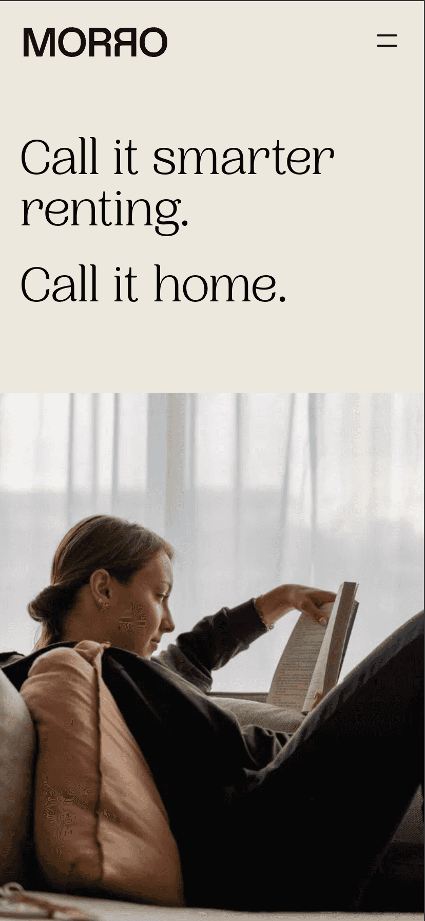
As the lead product designer I created an entire set of responsive designs, prototypes and Design System / UI Kit for Morro. The client was rebranding this particular sub-brand of the company and needed a solution to a complex set of brand guidelines, with the aim of providing the users with a clear and simple way to discover property locations for rent. Playful, sensory and ephemeral, the strong brand identity is core to the experience of this website, but it also needs to house a growing portfolio of properties, functionality and considered user journey was essential for an effortless experience.
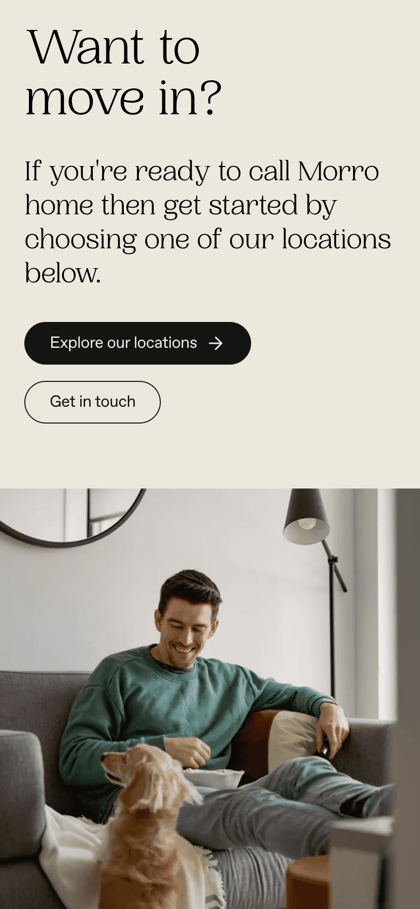
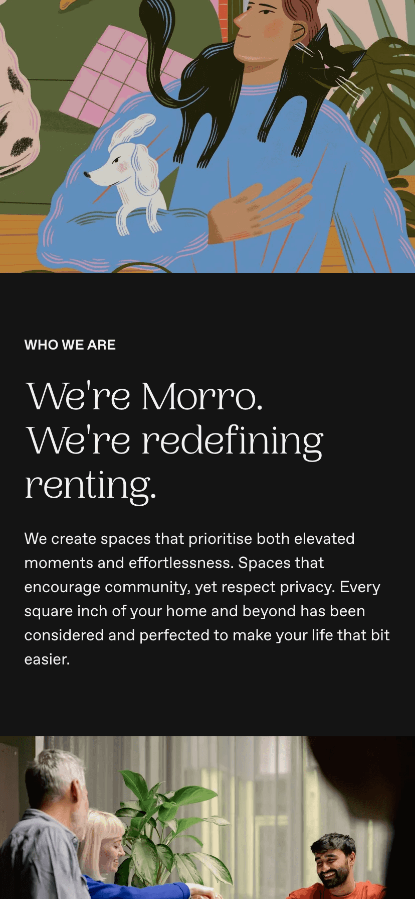
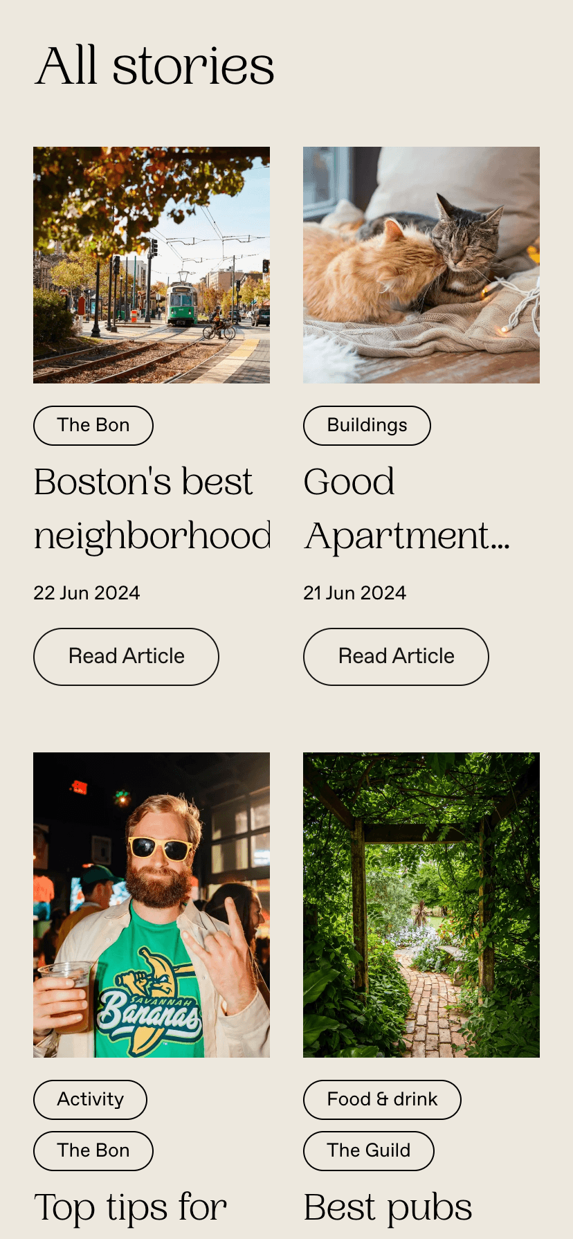
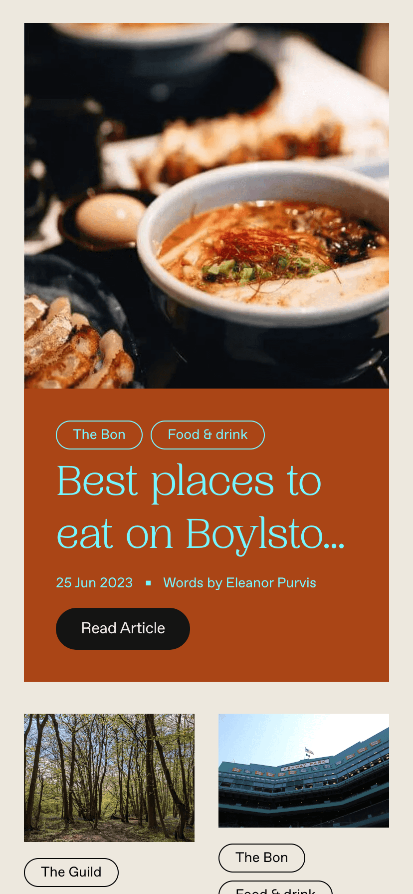
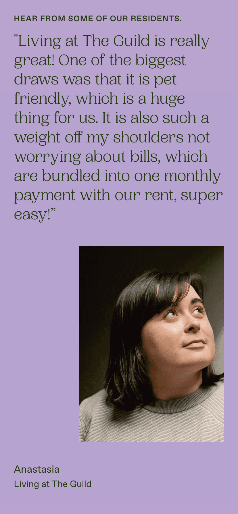
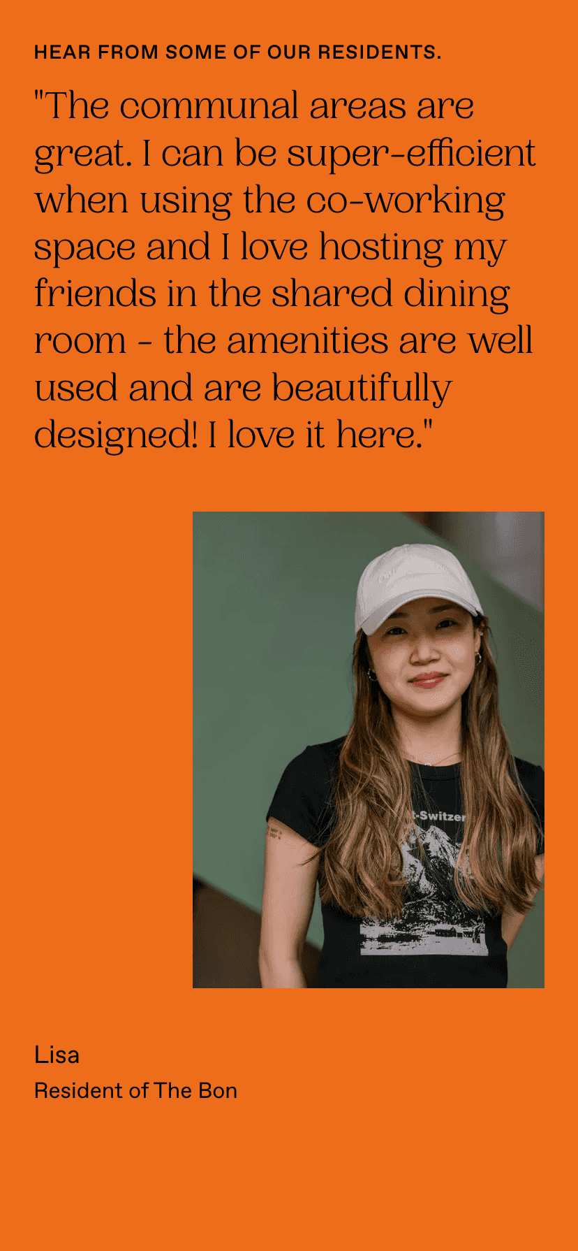
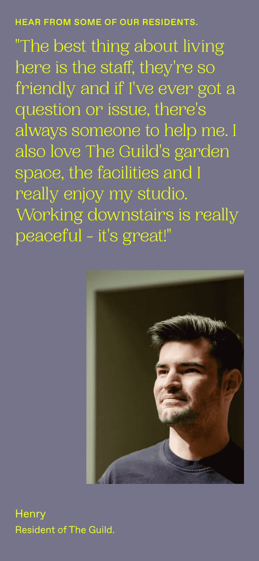
Truly people first, we featured real tenants and their testimonials
A scalable design system to grow with the expansion of Morro's locations and identities
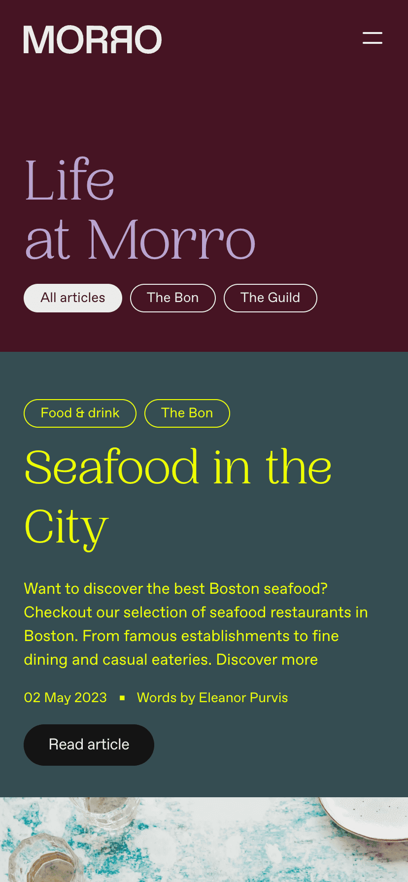
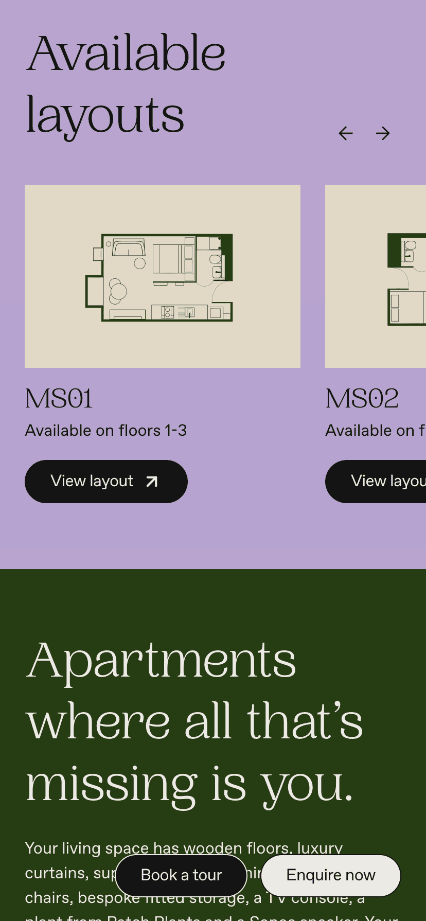
Each location that Morro provides has it's own logo and colour-way (a two colour combination), and future locations will see the same treatment so needed a mechanism for this to be extremely obvious on the landing pages of the locations and the properties. Using large areas of colour blocks and type colour we were able for these location pages and propery pages to be essentially themed allowing each one to be recognisable in it's own right. The top level Morro site pages and content had a large playful colour palette allowing many contemporary combinations whereas the locations and property pages where honed in and paired back to aid in brand recognition for each.
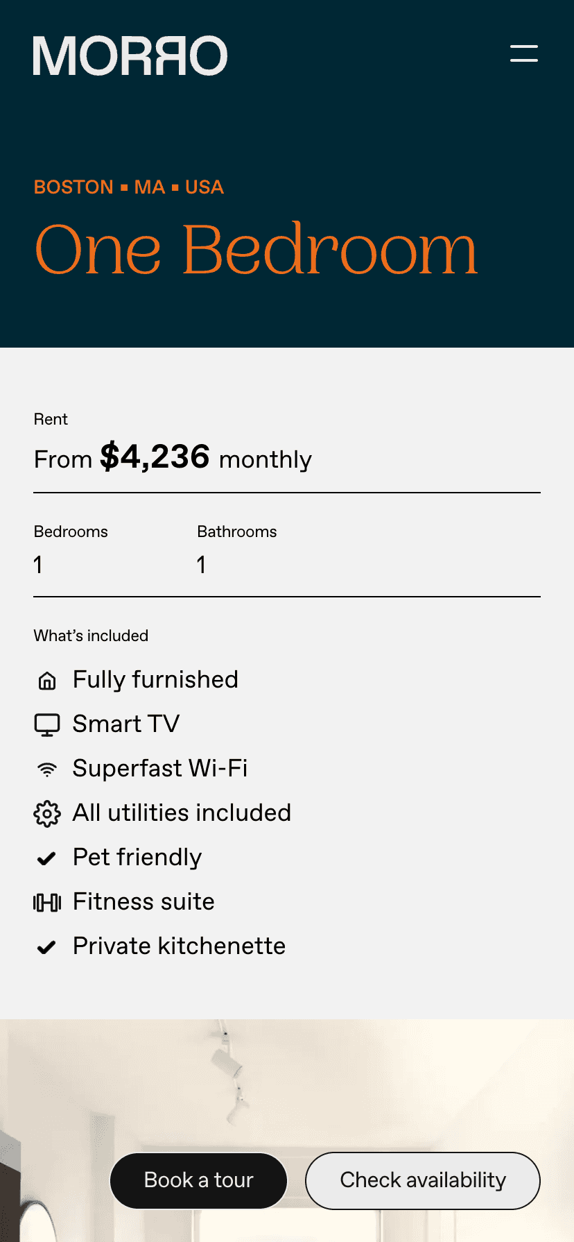
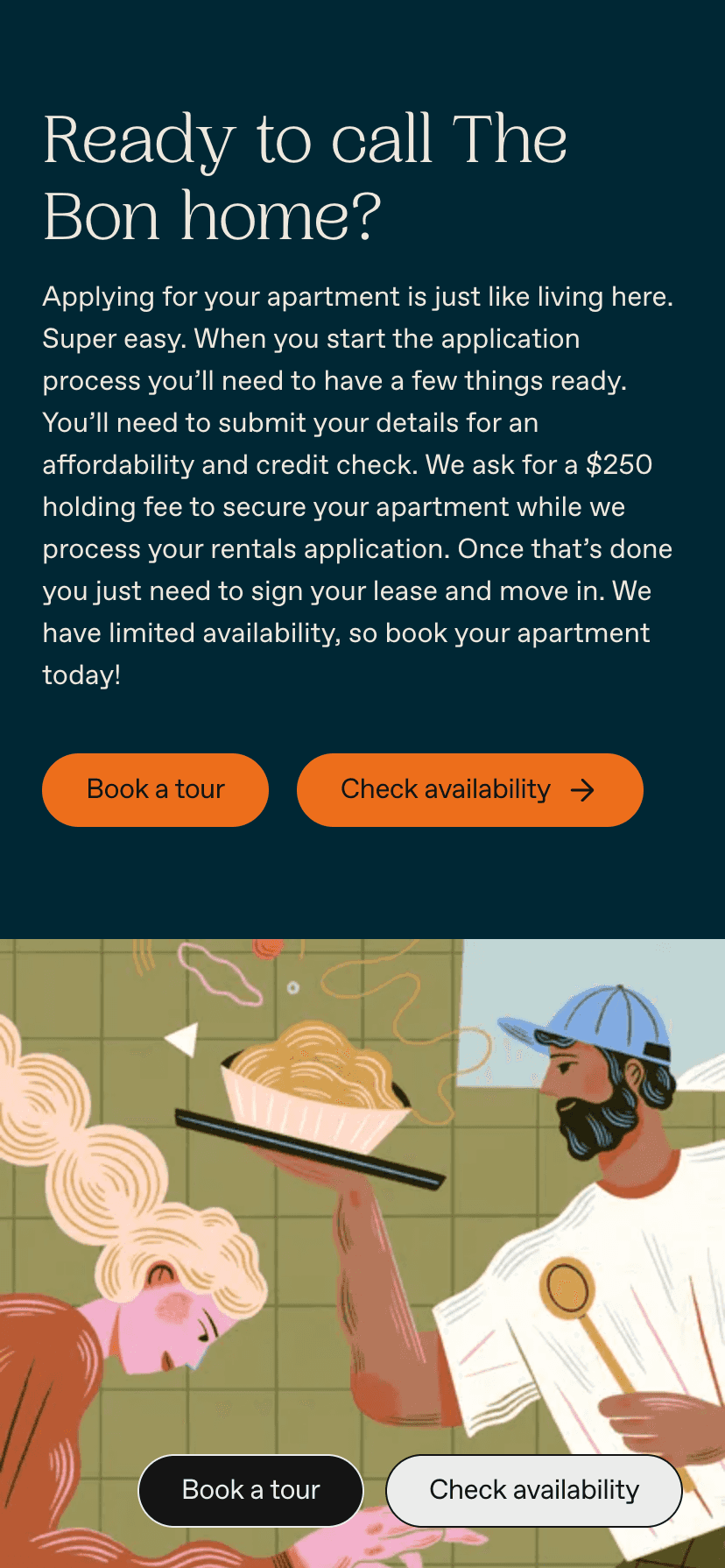
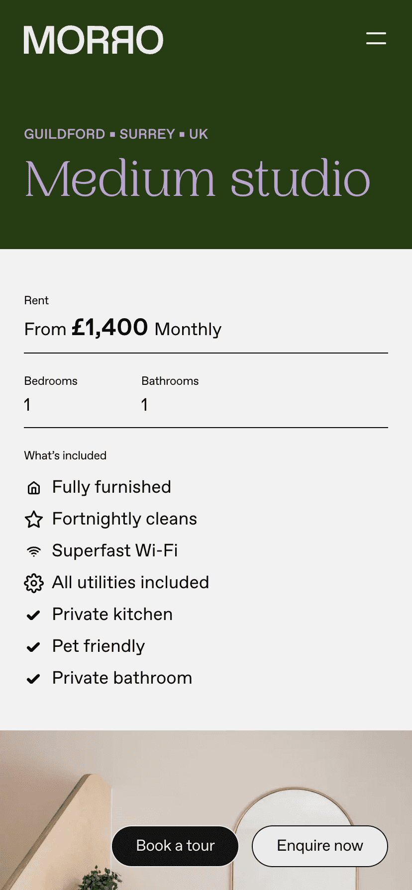
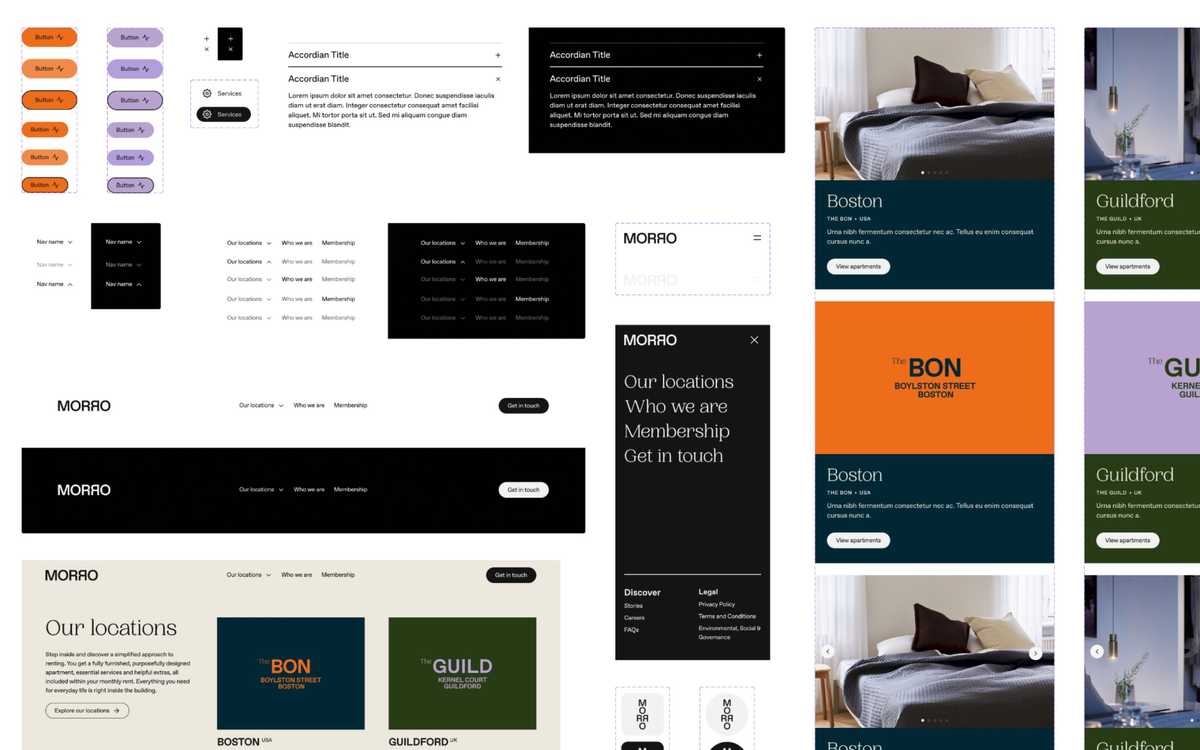
Morro Design System Sample